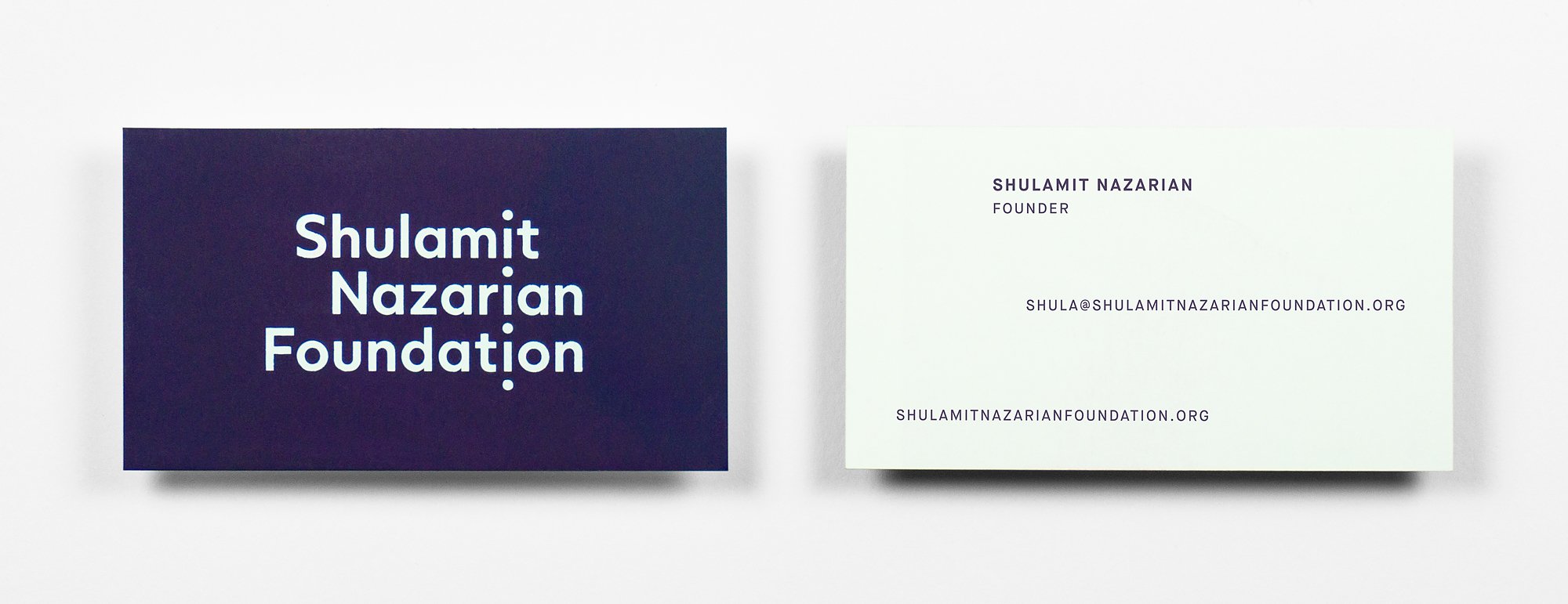
This is a wonderful initiative started by the renowned LA gallerist to support artists building bridges between the Middle East and the United States. The identity needed to be striking and independent from that of Shulamit’s gallery. The website would act as the main portal for the foundation, promoting the mission and providing practical information. We settled on a distinctive colour and bold use of typography with a repeat circle graphic. These three components translate clearly and neatly across all aspects of the foundation’s identity.


